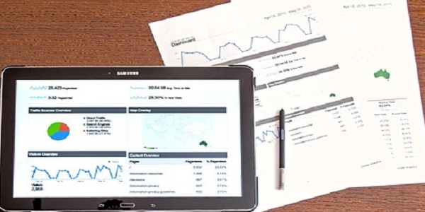
Dashboards are an important part of managing and reporting on Human Resources. They form the basis of informed decision making and business insights. Dashboards have a variety of uses from keeping management and stakeholders informed about business or project updates to tracking problems to providing KPI’s and other metrics to managing talent.
As with any communication or decision-making tool, presentation and design is as critical as functionality. This training focuses on what you need to know to create an interactive professional-looking dashboard using Excel.
WHY SHOULD YOU ATTEND?
This training will provide you with a solid foundation that you can use to build your own dashboards and reports.
AREA COVERED
- Best practice for setting up data sources
- Using Pivot Tables to summarize data
- Visual communication using charts
- Using formulas to create summaries
- Creating interactive filters with Slicers
- Automating the dashboard with a simple macro
- Using protection to prevent accidental changes
LEARNING OBJECTIVES
- Learn how to create a stunning, interactive professional-looking dashboard using Excel
- Learn how to make the dashboard maintenance-free when new data becomes available
- Learn how to create the pivot tables needed to drive the dashboard
- Learn how to create great looking visuals
- Learn how to automate elements of the dashboard with a macro
- Learn how to prevent accidental changes to the dashboard
WHO WILL BENEFIT?
This webinar is for any user of Excel who wants to learn how to create Excel dashboards. You should have an intermediate level of Excel knowledge and preferably know how to create a basic pivot table.
The training will be delivered using Excel 2016 for Windows. However, much of the functionality is available in Excel 2013 and 2010.
This training will provide you with a solid foundation that you can use to build your own dashboards and reports.
- Best practice for setting up data sources
- Using Pivot Tables to summarize data
- Visual communication using charts
- Using formulas to create summaries
- Creating interactive filters with Slicers
- Automating the dashboard with a simple macro
- Using protection to prevent accidental changes
- Learn how to create a stunning, interactive professional-looking dashboard using Excel
- Learn how to make the dashboard maintenance-free when new data becomes available
- Learn how to create the pivot tables needed to drive the dashboard
- Learn how to create great looking visuals
- Learn how to automate elements of the dashboard with a macro
- Learn how to prevent accidental changes to the dashboard
This webinar is for any user of Excel who wants to learn how to create Excel dashboards. You should have an intermediate level of Excel knowledge and preferably know how to create a basic pivot table.
The training will be delivered using Excel 2016 for Windows. However, much of the functionality is available in Excel 2013 and 2010.
Speaker Profile
 Mike Thomas
Mike has worked in the IT training business since 1989 where his expertise and experience covers designing, delivering training courses, writing training materials and recording and editing video-based tutorials. Although he is a subject matter expert in a range of Microsoft technologies and has worked extensively with Mac OSX and Mac-related software since 2006; however, his passion is for all-things-Excel and in 2012 he founded the website theexceltrainer.co.ukMike is a Fellow of The Learning and Performance Institute and has worked with and for a large number of global and UK-based companies and organizations across a diverse range of sectors. In …
Upcoming Webinars

California Meal and Rest Breaks: What You Dont Know Can Cos…

Responding to EEOC Discrimination Charges-What's Your Busin…

Female to Female Hostility @Workplace: All you Need to Know

With Mandatory Paid Leave Gaining Ground Is It Time To Do A…


Conflict Resolution - Prevent, De-escalate, Resolve

Implementing an Effective Human Error Reduction Program

When Employees Travel: Wage and Expense Rules Employers Mus…

Validation Statistics for Non-Statisticians

Form 1099-MISC and 1099-NEC Compliance Update 2024

The Totally Organized Professional Is All About Outcomes

Project Management for Non-Project Managers - Scheduling yo…

GAMP5, Second Edition and Alignment with Computer Software …

Why EBITDA Doesn't Spell Cash Flow and What Does

Sunshine Act Reporting - Clarification for Clinical Research

Understanding the Math of HR… So You Can Show How HR Impact…

FFIEC BSA/AML Examination Manual: What Compliance Officers …

How to Address ISO's New Climate Change Requirements

I-9 Audits: Strengthening Your Immigration Compliance Strat…


Re-imagine Finance & Accounting Made Simple. Three Webinars…

Stay Interviews: A Powerful and Low-Cost Employee Engagemen…


How To Conduct An Internal Harassment And Bullying Investig…


Effective Onboarding: How to Welcome, Engage, and Retain Ne…

Managing Toxic & Other Employees Who Have Attitude Issues


Analytical Method Validation Under Good Laboratory Practic…

Do's and Don'ts of Documenting Employee Behaviour, Performa…

Do's and Don'ts of Giving Effective Feedback for Performanc…

Onboarding New Hires: Leverage the Potential of Artificial …

Using Behavior Based Interviewing for Finding the Best Matc…

Tattoos, hijabs, piercings, and pink hair: The challenges …

How to Document Employee Discussions and Why it is Important

Harassment, Bullying, Gossip, Confrontational and Disruptiv…

Best Practices for Working With Vendors and Suppliers

Understanding the Artificial Intelligence Landscape

Marketing to Medicare or Medicaid Beneficiaries - What You …

Accounting For Non Accountants : Debit, Credits And Financi…

Principles & Practices for the Cybersecurity of Legacy Medi…

Independent Contractor vs. Employee New Rule Issued by The …

Ultimate Persuasion Strategies! - Secret Influence Tools & …

Kicking your Employee Retention Efforts into Overdrive: Sta…
