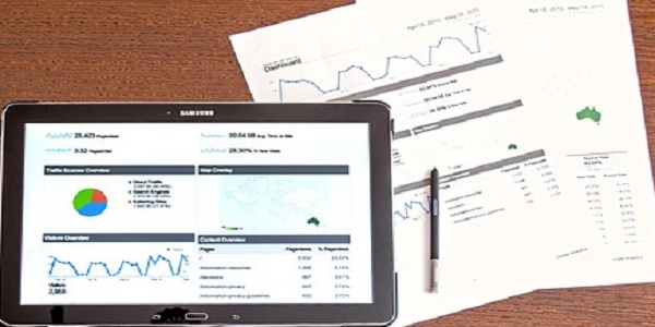
In this enlightening live webcast, Excel expert David Ringstrom, CPA, introduces you to Excel dashboards. Dashboards empower users to assimilate large amounts of data quickly and easily via charts and summary tables. David demonstrates (1) how to bring data into Excel from other sources, (2) different techniques for presenting your information in dashboard form, (3) how to use Excel’s PivotTable feature to condense large amounts of data, (4) how to filter data faster with the Slicer feature, and much more
WHY SHOULD YOU ATTEND?
- David teaches participants how to summarize large amounts of data by creating and using Microsoft Excel dashboards.
- David demonstrates every technique at least twice: first, on a PowerPoint slide with numbered steps, and second, in Excel 2016.
- David draws participants’ attention to any differences in Excel 2013, 2010, or 2007 during the presentation as well as in his detailed handouts.
- David’s detailed handouts, with numbered steps, serve as reference material you can utilize going forward.
- David provides an Excel workbook that includes a majority of the examples he uses during the session.
AREA COVERED
- Learning how to control multiple pivot tables and charts instantly with the Slicer feature in Excel 2010 and later.
- Using the Linked Picture feature to place pivot tables in close proximity to each other without posing conflicts.
- Discovering how Microsoft Query allows you to create self-updating links to databases, spreadsheets, textfiles, and other data sources.
- Creating dynamic and interactive graphs with Excel’s PivotChart feature.
- Seeing how the Sparkline feature empowers you to create tiny, in-cell charts for showing trends of data.
- Filtering data faster by way of the Slicer feature in Excel 2010 and later.
- Discovering how pivot tables differ from worksheet formulas and learn the importance of the Refresh command.
- Using Excel’s PivotTable feature to condense large amounts of information into manageable chunks.
LEARNING OBJECTIVES
- Identify ways to use Excel dashboards to quickly assimilate large amounts of data.
- Define how to create dynamic and interactive graphs with Excel’s PivotChart feature.
- State how Microsoft Query allows users to create self-updating links to databases, spreadsheets, text files and other data sources.
- Apply Excel’s PivotTable feature to condense large amounts of data.
- Create dynamic charts with Excel’s PivotChart feature.
- Utilize Excel’s Sparklines feature to create in-cell charts that allow you to display trends in a compact fashion.
WHO WILL BENEFIT?
- Marketing
- Banking
- Finance
- Management Consulting
- Human Resources
- CPAs and Accountants
- Marketing and Management Consultants
- Bankers
- CFOs
- Controllers
- Financial Planners and Consultants
- Business Professionals
- Business Analysts
- Bookkeepers
- Excel Users
- David teaches participants how to summarize large amounts of data by creating and using Microsoft Excel dashboards.
- David demonstrates every technique at least twice: first, on a PowerPoint slide with numbered steps, and second, in Excel 2016.
- David draws participants’ attention to any differences in Excel 2013, 2010, or 2007 during the presentation as well as in his detailed handouts.
- David’s detailed handouts, with numbered steps, serve as reference material you can utilize going forward.
- David provides an Excel workbook that includes a majority of the examples he uses during the session.
- Learning how to control multiple pivot tables and charts instantly with the Slicer feature in Excel 2010 and later.
- Using the Linked Picture feature to place pivot tables in close proximity to each other without posing conflicts.
- Discovering how Microsoft Query allows you to create self-updating links to databases, spreadsheets, textfiles, and other data sources.
- Creating dynamic and interactive graphs with Excel’s PivotChart feature.
- Seeing how the Sparkline feature empowers you to create tiny, in-cell charts for showing trends of data.
- Filtering data faster by way of the Slicer feature in Excel 2010 and later.
- Discovering how pivot tables differ from worksheet formulas and learn the importance of the Refresh command.
- Using Excel’s PivotTable feature to condense large amounts of information into manageable chunks.
- Identify ways to use Excel dashboards to quickly assimilate large amounts of data.
- Define how to create dynamic and interactive graphs with Excel’s PivotChart feature.
- State how Microsoft Query allows users to create self-updating links to databases, spreadsheets, text files and other data sources.
- Apply Excel’s PivotTable feature to condense large amounts of data.
- Create dynamic charts with Excel’s PivotChart feature.
- Utilize Excel’s Sparklines feature to create in-cell charts that allow you to display trends in a compact fashion.
- Marketing
- Banking
- Finance
- Management Consulting
- Human Resources
- CPAs and Accountants
- Marketing and Management Consultants
- Bankers
- CFOs
- Controllers
- Financial Planners and Consultants
- Business Professionals
- Business Analysts
- Bookkeepers
- Excel Users